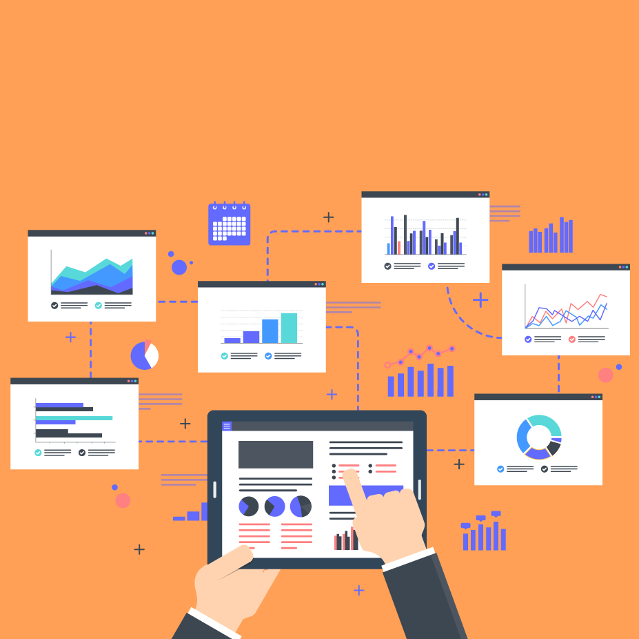
Best practices for effective data visualization
Lucid Content
Reading time: about 10 min
Topics:
Numbers provide us more information than speculation or intuition ever could. Though a strong sixth sense can help you tackle decisions that loom larger than data, having accurate quantitative data is the best way to determine the health and direction of your organization’s performance.
Whether pitching for funding for a new project, describing year-over-year performance to shareholders, or making predictions on a stock’s performance, your point can be made clearer, more relatable, and more actionable with the right data visualization.
Take a look at these data visualization best practices.
What is data visualization and why is it important?
Data visualization is the process of creating visual representations of data sets. These representations are designed to display critical information and communicate insights by using bars, graphs, lines, percentages, ratios, and more. Any time you’ve seen a table of LeBron James’s Game 7 playoff stats on ESPN, a Dow Jones Industrial Index on MSNBC, or a presidential primary election voting map on CNN, you’ve been the benefactor of good data visualization.
There are a few schools of thought on how to visualize data, but the resounding thought leader is Edward Tufte, American statistician, computer science professor, and author of the information design treatise The Visual Display of Quantitative Information. He argues that because data visualization is about simplifying complex information and showing relationships between data sets, your data visualizations must follow two principles:
- You need to communicate complex ideas with clarity, precision, and efficiency.
- You must give the viewer the greatest number of ideas in the shortest time with the least ink in the smallest space.
With these principles in mind, let’s see how you can create an impactful data visualization that displays as much relevant information with as simple a design possible.

Data visualization best practices
Having the correct data is only half the battle—you also have to understand how to display it correctly to make your point. Here are a few of these practices to follow as you put together your data visualizations.
Consider the goal of the presentation
Numbers don’t lie, but how you choose to display those numbers certainly affects the conclusion your audience draws.
Before you can invest in the right data visualization tool, you need to identify the goal of your presentation—you wouldn’t send a screwdriver to do a hammer’s job. While you may hold no impact over the patterns within a data set, you may choose which data to display and the context surrounding it based on the position of your audience.
Above all, your data visualization must be useful to its audience.
For example, imagine that you work for an anti-pollution nonprofit and you’re pitching for funding to your top benefactors for a new research project. While they might find it interesting to know the growth rates of certain threatened species over time, your goal is to get them to act with urgency, respond to an imminent threat, and donate to your cause.
In this scenario, your presentation should focus on the dire outcomes if these benefactors don’t act, and your data visualization should reflect that. You might consider a line graph depicting the downward trend of global species if pollution is left unabated, an area map showing areas that will be most heavily targeted by continuous pollution (even better if these areas have direct ties to your benefactors), a detailed table of how money will be spent, a simple indicator of the impact of each individual dollar, and a line graph showing the success of your past efforts.
Address your audience and their needs
When creating your data visuals, make empathy your best friend. Begin by considering your highest priority persona. Ask these questions:
- Who will be consuming this data?
- What are their challenges, and what are their obstacles in overcoming those challenges?
- Is this presentation for the general population or a select group of experts?
- What goals/metrics matter to my audience?
- What action or decision do I want this audience member to make?
The answers to these questions will produce drastically different solutions for your data visualization. Data visualizations for everyday consumers and newcomers should be structured, approachable, and engaging, with clear language about what viewers should take away from the data. Data visualizations for experts, however, can take a much more detailed approach, focusing on data granularity to allow for discovery and exploration.
That last question is key—you have to determine what decisions or actions you aim to influence and how often those decisions are made.
Is the decision singular, meaning you need only make it once, or is it recurring, meaning you may need to address this issue weekly, quarterly, or annually? Your data visualization needs to align with the frequency of the action and decision-making process.
Determine the best way to visualize your data
Architect Louis Sullivan famously coined the maxim “Form follows function,” describing how a building’s aesthetics should always be submissive to its purpose.
Adopt this mentality when approaching data visualization: Are you comparing performance over time? If so, a line graph would be a good fit. Are you comparing market share across different regions? Maybe you could use an area map.
Once you have identified the purpose of the data you are sharing (displaying change over time, comparing performance across sectors, etc.), decide what type of chart best tells your data’s story. Below are the most common types of data visualizations. Some graphs and charts may be combined to produce hybrid visualizations, giving presenters the option to share even more valuable information.
Data visualization types
Table
A table is a simple display of numbers and values across rows and columns. Tables are best for posting nominal information like budgets and statistics.

Bar graph
A bar graph is used to compare the values of different categories and aggregate sums for different entities like GDP, annual household income by region, etc. Bar graphs are great for understanding the distribution between data and comparing values of data sets, and you can stack these visuals to demonstrate the composition of a data set.

Line graph
A line graph is used to show changes over time and is the tool of choice when illustrating trends, making forecasts, and demonstrating growth. Line graphs are most often used to compare values, analyze trends, and better understand relationships between value sets.

Pie chart
A pie chart shows a total divided into categories by percentage. Pie charts are used to compare values and demonstrate the composition of a data set. Although pie charts typically show an entire circle, as you can see in the example below, you can also show the percentages in a half-circle if it better accommodates your design. Keep in mind, pie charts are best for a "lightweight" comparison rather than an in-depth one.

Infographic
An infographic is an easy-to-read display of graphs, graphics, charts, and simple text designed to provide an overview of a subject. Infographics are highly used in large media campaigns to support reporting or when educating the general public on a topic or initiative.
Scatter plot
To show how two variables correlate, like weather and vacation spending, use a scatter plot. Most often, scatter plots are used to compare values, show the distribution of data, and demonstrate the relationship between value sets. But be careful—while scatter plots can help inform causation because they are limited to two variables, they can also inaccurately suggest correlation.

Area chart
An area chart displays overlapping distribution maps and is a great way to compare proportions of multiple sets in a category, like marketing spending vs. manufacturing spending. Area charts are primarily used to illustrate the composition of a data set.

Area map
An area map allows you to see which geographical areas are important to your business by visualizing data as points of color. It’s typically used in identifying sales regions and following up on marketing efforts.

Show your KPIs clearly
Since your task is to display complex data sets simply and elegantly, focus on one KPI at a time. The best visual aid in showing a single KPI is an indicator, such as a gauge or a number—it simply indicates the performance of a single metric.
Let’s say, for example, that your office is raising money for a volunteer cancer research project. Your fundraising manager wants to show everyone how close the office is getting to its fundraising goal and displays a hand-drawn chemical beaker in the front of the office, showing you how your donations add up and contribute to the final goal.
Provide context and tell a story
If data visualization doesn’t have context, does it make a difference in your presentation? Data visualization is best used when it shows a relationship between sets of data, like temperature and humidity or GDP and per capita income.
- To inspire action, have your data point to a direct action to take. Have your data show a direct cause-and-effect, or avoidance-and-impact, relationship.
- To influence a decision, compare to a previous period or benchmark. Present your data in context to the past in order to make forecasts about the future. If people can trust what they have experienced, perhaps they can trust your proposal.
Remember—the more context, the better. You want to get your stakeholders to take action, and the more direction they have on that, the better.
Keep it simple
Data can be complex but often tells a simple story.
Keep things simple by limiting your color palette—for example, pie charts should have no more than five distinct color values. Generally, all graphs should limit the number of colors you use to ensure your visual isn’t confusing.
Consider using stacked charts to see values over a set of time and horizontal bar charts if you need longer text descriptions or need to display values over time.
Data visualization don’ts
We’ve provided data visualization guidelines for you to get started on your next graph and chart—but there are also some clear trends to avoid.
Don’t fall into the “it looks cool” trap
A flashy graph with irrelevant information has the utility of toothpaste in a champagne bottle. Make sure your visuals display relevant information accurately, simply, and elegantly, and then worry about how to make it interactive, animated, etc.
Don’t give too much
Too much information can overwhelm your audience and draw attention away from what’s actually important, even if your chosen graph is visually appealing. Condense your presentation to only the relevant and essential elements.
Don’t give too little
On the other side of the coin, make sure that you’re properly educating your audience. Include disclaimers for any discrepancies in data, give comparisons if they need context for certain claims, and spell out your conclusions where it’s vital.
Presenting and sharing your visuals
With industry-leading diagramming software and seamless integration with top platforms like Slack, G Suite, and Zoom, creating and sharing your data visualization is as simple as signing up with Lucidchart.
For collaboration in a snap, try Lucidchart's visual workspace today.
Try it freeAbout Lucidchart
Lucidchart, a cloud-based intelligent diagramming application, is a core component of Lucid Software's Visual Collaboration Suite. This intuitive, cloud-based solution empowers teams to collaborate in real-time to build flowcharts, mockups, UML diagrams, customer journey maps, and more. Lucidchart propels teams forward to build the future faster. Lucid is proud to serve top businesses around the world, including customers such as Google, GE, and NBC Universal, and 99% of the Fortune 500. Lucid partners with industry leaders, including Google, Atlassian, and Microsoft. Since its founding, Lucid has received numerous awards for its products, business, and workplace culture. For more information, visit lucidchart.com.
Related articles
Learn how to customize your visual data
Lucidchart puts data to work by transforming it into a visual landscape. Learn how—includes a free course!
Histogram vs bar graph: What’s the difference?
Dive into histograms vs. bar charts and when to use each. Learn how to pick the best format to analyze and present your data.
Bring your bright ideas to life.


By registering, you agree to our Terms of Service and you acknowledge that you have read and understand our Privacy Policy.