Wireframes vs mockups: Determining the right level of fidelity for your project
Lucid Content
Reading time: about 6 min
Topics:
When you picture the design process of a website or application, you probably think of the complex coding and digital interfaces required to bring those designs to life.
But most designs start on a much simpler scale.
Low-fidelity wireframing is a basic but invaluable tool for planning and outlining project designs. Whether you’re sketching on a whiteboard or using a digital canvas, wireframes help team members and stakeholders of various design chops to collaborate and plan applications before developing those ideas in realistic models and prototypes.
Wireframes vs. mockups vs. prototypes
When designing an app or webpage, UX and UI designers and developers use a number of planning tools to iterate their ideas and outline their solutions. There are three main levels of visual outlines:
- Wireframes
- Mockups
- Prototypes
Each solution helps designers map and visualize their design plans at varying degrees of detail and functionality through the development phase.
What is a wireframe?
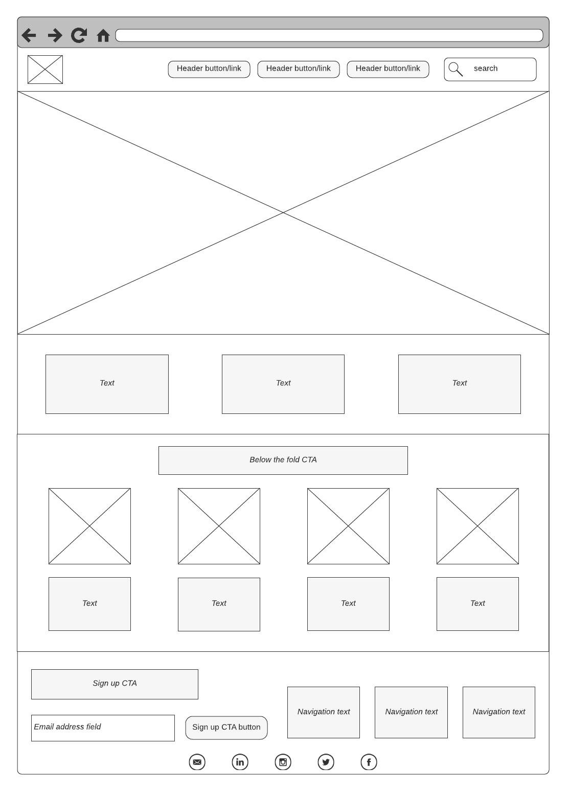
A wireframe is a skeletal blueprint or framework that outlines the basic design and functions of a user interface (such as a website or application).
The goal of a wireframe is to quickly and easily communicate:
- The contents of the page
- The page structure and layout
- The app’s functions
In other words, a wireframe describes the basic structure, functions, and content of the page.
Wireframes can be low-fidelity or high-fidelity, depending on your needs and preferences. A low-fidelity wireframe is often sketched out on paper or a whiteboard and is a useful way to brainstorm the basic outline for your design. A high-fidelity wireframe has more detail and may include simple workflows and interactions.

What is a mockup?
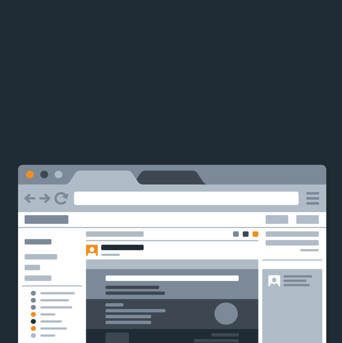
A mockup is the next, more in-depth iteration of the wireframe outline. A mockup is a static wireframe that includes more stylistic and visual UI details to present a realistic model of what the final page or application will look like.
A good way to think of it is that a wireframe is a blueprint and a mockup is a visual model.
A mockup typically includes additional visual details such as:
- Colors, styles, graphics, and typography
- Styled buttons and text
- Navigation graphics
- Component spacing
Mockups are useful tools for understanding and communicating what the final interface should look like and gives stakeholders a chance to preview design and style choices before committing to building the app in a functional prototype.
What is a prototype?
A prototype is an early model of a product or design built to test the concept.
A prototype is typically a functional and interactive simulation that includes all the stylistic details intended for the final deliverable. This model allows developers to see how their product works in a real environment and test the usability of their designs.
The main purpose is to test the design before investing time and money to develop the full product. A prototype can help developers work out any bugs or design flaws, see the user flow and interactions in practice, and build support and engagement from stakeholders.
High-fidelity vs. low-fidelity design
Before we can dive into the different levels of wireframe design, we need to understand low-fi and high-fi design.
Fidelity describes the level of detail and realism of a design. When sketching a wireframe or mockup, the level of fidelity could range from a basic outline on paper (low-fidelity) to a more in-depth—and even interactive—application (high-fidelity).
We’ll break down these design approaches below.
What is a low-fidelity wireframe?
A low-fidelity wireframe typically starts as a simple static outline on paper or on a digital canvas like Lucidchart.
Low-fi wireframes help guide the brainstorming process as designers and developers sketch out the main functions and workflows an application might need. Because low-fi designs are quick outlines, they are easy to revise and build on as the team fleshes out ideas. If the team decides to go in a different direction, they haven’t wasted valuable resources to build out that idea yet.
When to use low-fidelity wireframes
Low-fidelity (low-fi) wireframing is a quick and easy way to visualize basic design concepts and plans. Use low-fi wireframes to outline visual and typographic hierarchies, plan interactions, navigation, and transitions, and organize the structure of the application’s interface.
Benefits
Low-fi wireframes have a few key benefits for early design planning:
-
Inexpensive: All you need is a pen and paper, a whiteboard, or a digital canvas. Because you’re creating a simple outline, you don’t risk sinking additional costs into the development of the design yet.
-
Fast: You can create a low-fi wireframe in minutes, allowing your team to sketch out and compare multiple ideas in one sitting. Low-fi wireframes are more about the outline than the details, so you can use placeholders and simple text to communicate your ideas quickly and efficiently.
-
Collaborative: Low-fi wireframes don’t require special design or coding skills so you can gather input from a diverse team of stakeholders, including those with no technical background.
So when should you use a low-fi wireframe?
Low-fi wireframes are perfect for early design planning meetings but can support brainstorming sessions at any stage of development. They are also great when you want input from multiple stakeholders who don’t have a design background. Anyone can contribute and collaborate on a low-fi wireframe design.
While most wireframing will take place early in development as you plan the project, they are also helpful at any stage where you need to go back to the drawing board.
For example, if you build out a prototype for an initial design and discover usability or workflow issues, you can use a wireframe to sketch out new workflow plans or add in interactions you previously missed.
Lucidchart makes it easy to plan, share, and integrate low-fi wireframe iterations into your design workflows so that each team member has access to the most up-to-date information.
Avoid duplicating work and keep your team on the same page by building and sharing your wireframes in one collaborative dashboard. Lucidchart’s intuitive flowchart solution integrates with your favorite tools to make filesharing easy, so you can connect multiple wireframe files directly to your process maps.
What is a high-fidelity wireframe?
High-fidelity (high-fi) wireframes go a step further than low-fi wireframes to include more details and illustrate simple interactions.
Unlike low-fi wireframes, hi-fi wireframes are usually clickable and demo basic interactions and application flows, like logging in or simple navigations.
When to use high-fidelity wireframes
High-fidelity wireframes are best applied after an initial brainstorming session when you’ve already mapped out the basic structure and outline for the application. Usually, high-fi wireframes are created as the next iteration of a design based on an original low-fi wireframe.
Hi-fi wireframes include color, style, typography, and spacing details—often with basic interactions—so designers, developers, and other stakeholders can visualize the plan.
Use high-fi wireframes when you want to present a simplified but realistic model of what the final interface will look like and how it will behave.
This wireframe will help team members and stakeholders make informed decisions about what elements are working, what elements are missing, and what usability issues might exist before they invest time in creating and testing a prototype.
Low-fidelity wireframes ensure that engineers build what product managers and UX professionals expect, saving teams valuable time and money in the overall development process.
Map out and design applications easily and clearly on Lucidchart. With UI, iOS, Android, and other mockup shapes available, plus layers and actions to make your designs interactive, our visual workspace will help you outline low-fi wireframes in no time.

Want to work with your team to create a low-fidelity mockup in Lucidchart?
See our tutorialAbout Lucidchart
Lucidchart, a cloud-based intelligent diagramming application, is a core component of Lucid Software's Visual Collaboration Suite. This intuitive, cloud-based solution empowers teams to collaborate in real-time to build flowcharts, mockups, UML diagrams, customer journey maps, and more. Lucidchart propels teams forward to build the future faster. Lucid is proud to serve top businesses around the world, including customers such as Google, GE, and NBC Universal, and 99% of the Fortune 500. Lucid partners with industry leaders, including Google, Atlassian, and Microsoft. Since its founding, Lucid has received numerous awards for its products, business, and workplace culture. For more information, visit lucidchart.com.
