How to plan a website: Tools and templates to help you attract and keep visitors
Reading time: about 7 min
Topics:
Have you ever wondered how many websites there are in the world? It’s hard to pinpoint the exact number of sites because the number changes almost constantly. As of January 2019, the Netcraft Web Server Survey says there are over 1.5 billion websites.
Because people have so many sites to choose from, it can be a daunting task to develop a website that will draw customers. It’s not like you can simply throw together some HTML, use some pretty colors, slap on some eye-catching graphics, and expect customers to instantly flock to your site.
Even if you could, pretty pictures and colors alone will not drive customers to your site in the numbers you expect. Planning how your website will look and how it will function is just as important as building it.
In this article, we will give you a simple website planning guide and offer some online website planning tools that can help you create a compelling site that will appeal to your customers.
Step 1: Preplanning your website
Before you start tagging HTML, coding, scripting, or throwing graphics at your site, you need to determine what the website will be and who it is for.
What are your website’s objectives?
You should already have a business plan that defines your goals. With the goals from your business plan in mind, begin your website planning by defining the site’s goals. Answer questions such as:
- Who is the target audience? Who will be more likely to visit your site and buy your products?
- What are the goals of this website? Do you want to:
- Build brand awareness?
- Generate new leads?
- Increase brand awareness?
- Improve communication with customers?
- Create an informative blog?
- Increase sales?
- Provide access to a social discussion community?
- What information will you need on the site to achieve your goals? What keywords will you use to drive traffic from organic search?
- What is the best way to present information to your target audience? Do you want a formal business tone, or do you want it to be casual?
Be sure that your website’s content is written for humans and search engines. It is important to write your content for SEO, but don’t inject your keywords so often that the content doesn’t make sense and becomes unreadable. Try to add your keywords where they make sense and where they can flow naturally so the information sounds like it was written by a human rather than a robot.
What are your competitors doing?
Chances are that other companies are already selling products or services similar to yours. Spend some time looking at their websites to analyze what is or isn’t working for them. Compare your observations with what you have in mind for your website. Their designs and layouts can give you inspiration for your website.
In addition, you should analyze current trends that are leading your market. Understanding these trends can help you to create a more useful and compelling website for your target audience.
As you define your website’s goals and analyze the competition, you may want to get input from team members and management.
Step 2: Planning your website’s structure and layout
As you start to determine what type of information you want on the site, you can start to plan how you want the website to be laid out.
Organize information and develop a sitemap
According to usability.gov, “information architecture (IA) focuses on organizing, structuring, and labeling content in an effective and sustainable way. The goal is to help users find information and complete tasks. To do this, you need to understand how the pieces fit together to create the larger picture, how items relate to each other within the system.”
Use IA to determine the usability of your site. Try to make sense of how your information is displayed and how your visitors will access it.
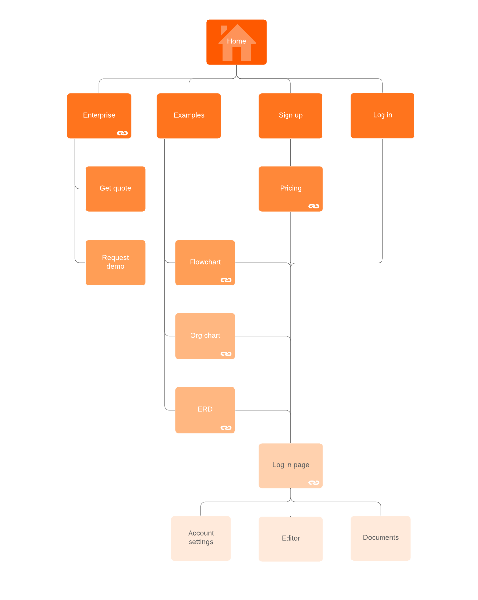
Create a sitemap to give you a visual representation of the navigation and flow of your site based on your IA analysis. Use Lucidchart to create a sitemap to help you decide which pages you want and how those pages should be arranged.
A sitemap can be useful for other people on your team or in other departments, such as graphic designers and programmers, who may be assigned to help with the website development.
Determine the navigation flow
Using the data you gathered when working through the information architecture, try to find patterns in the way your target audience seeks for and accesses information.
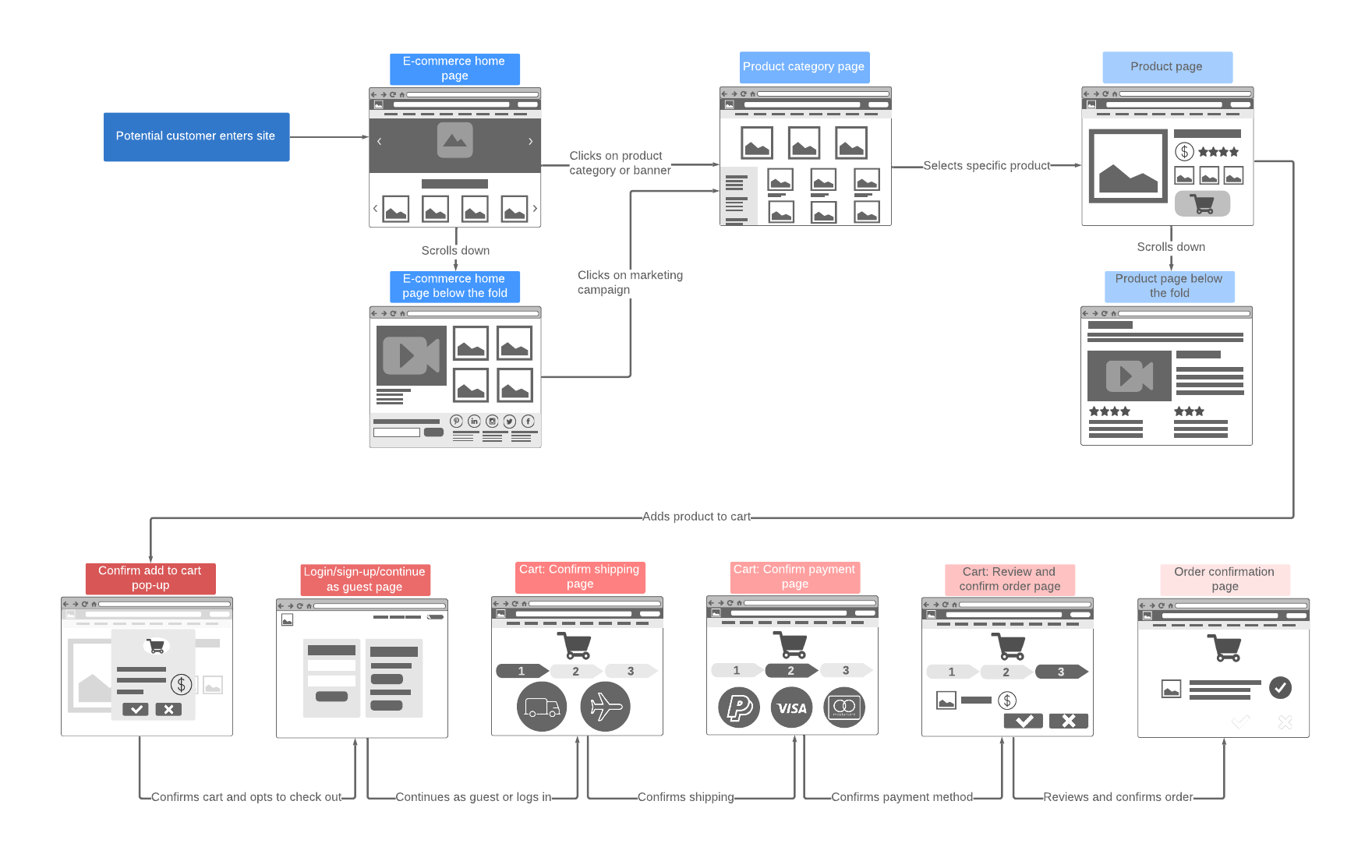
From the sitemap you created, you should have a better understanding of how many pages you will need for your website. Creating a flowchart or user flow diagram can help you map out a logical flow of how your ideal customer will access these pages. The flow includes the cues, such as phrases and images, that will keep your visitors engaged and keep them from leaving your site for another.

In addition, you will want to determine whether you will use top menu navigation, side menu navigation, or both. These menus are stagnant and remain at the top or side of every page. Top menus are generally limited to the available horizontal space at the top of the page. Clicking the top menu activates a drop-down menu where the user can access the information they are seeking.
Side menus are presented in a vertical tree hierarchy with folders and subfolders that can be expanded and collapsed as needed, letting the user drill down more deeply into the information they need.
Lucidchart has several templates that you and your team members can collaborate on in real time to develop a logical user flow for your site.
Step 3: Designing the layout
In this step, you can use tools such as mood boards and wireframes to begin experimenting with layouts and colors that will capture your company’s style, mood, brand identity, and voice.
A mood board is a kind of collage where you can place color, text, images, and other elements. Move these elements around to see how well they work together and to view how space is used and well the layout flows.
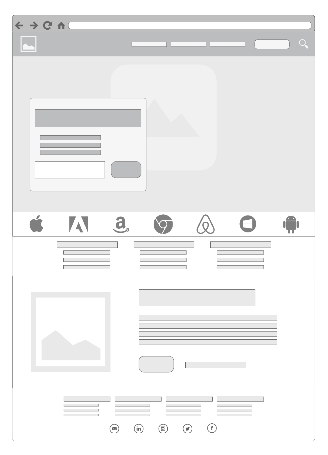
Use wireframes to get a grasp of your website’s functionality. Use the data you collected from your information architecture to form the layout and hierarchy of the page content. A wireframe will let you test site navigation.
Lucidchart has flexible, customizable templates you can use to create documents such as mood boards and wireframes. These documents are centrally located and can be accessed from anywhere in the world, giving you the freedom to collaborate with everybody involved in the website design even if they are not onsite.
Step 4: Building your website in a staging area
Before you put all the elements together and publish your new website, put it in a staging area that can be accessed by internal employees but not the general public. This is your chance to test the entire site exactly how it will look when it is posted for customer access.
Ask team members and other employees to access the staging area to make sure all the links work, the page elements sit on the page correctly when the browser is resized, check for typographical errors, overall functionality, and to get feedback on the layout and design. Feedback from employees who were not involved in the website planning can be very valuable because they are more likely to see things that those who worked with it every day have missed.
After the feedback comes in and everybody has signed off of the project, you can publish to a live site and let your customers know that site is available.
These steps are certainly not definitive, but they should give you a good base for thinking about what you want to do so you don’t blindly start building a site without really know where you want to take it.
Whatever steps you decide to take for website planning, be sure to use Lucidchart templates to create the documents you need to visualize your goals and to collaborate with your team.
Start your free accountAbout Lucidchart
Lucidchart, a cloud-based intelligent diagramming application, is a core component of Lucid Software's Visual Collaboration Suite. This intuitive, cloud-based solution empowers teams to collaborate in real-time to build flowcharts, mockups, UML diagrams, customer journey maps, and more. Lucidchart propels teams forward to build the future faster. Lucid is proud to serve top businesses around the world, including customers such as Google, GE, and NBC Universal, and 99% of the Fortune 500. Lucid partners with industry leaders, including Google, Atlassian, and Microsoft. Since its founding, Lucid has received numerous awards for its products, business, and workplace culture. For more information, visit lucidchart.com.
Related articles
How to Develop an App Using Visuals
Creating a mobile app isn’t easy. But with careful research and planning, you can take your app from idea to launch in just a few months. Use our step-by-step guide to plan your next app project.
How Lucidites Use Lucidchart: Diagrams for Marketing
At Lucid Software, we truly believe that our products will make work better for you and your colleagues. Why? Because we use them ourselves. See how Lucid Software employees (known as Lucidities) use Lucidchart and how our diagramming software could help employees in various roles at your company. First up: Lucidchart’s marketing team.
Bring your bright ideas to life.
By registering, you agree to our Terms of Service and you acknowledge that you have read and understand our Privacy Policy.


