How to make a bubble chart in excel
Shannon Williams
Reading time: about 3 min
Topics:
Your data can tell a story and persuade others if you present it in the right way. But what happens when you have multiple data sets? How can you elegantly display all the metrics you need without overwhelming your audience?
The answer: bubble charts. We’ll explain how a bubble chart can tastefully organize several dimensions of data and then show you how to make a bubble chart in Excel, right alongside your data, using Lucidchart.
Already know that you need a bubble chart? Skip down to the tutorial.
What is a bubble chart?
If you’re not sure whether a bubble chart best fits your project, let’s quickly define this type of visualization.
What is a bubble chart?
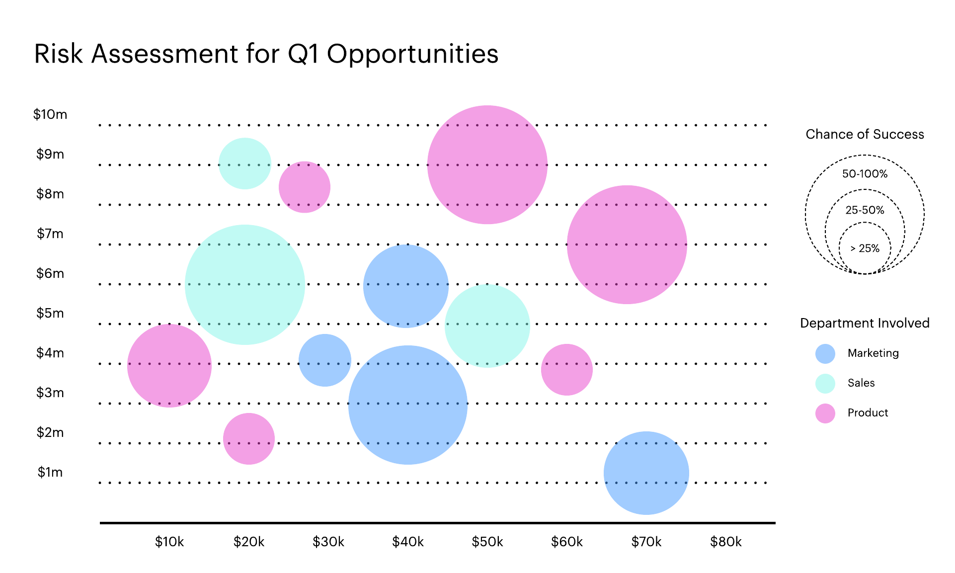
A bubble chart (also known as a bubble plot) displays data in three (or even four) dimensions. Like a traditional scatter plot, you can show different metrics on the x-axis and y-axis of the chart. Then you can visualize a third dimension of data through the scale of the bubbles. The larger the bubble, the larger its value. If you need to visualize a fourth data set, you can use different colors to group the bubbles into categories.
In other words, if you’ve had to use multiple bar graphs or scatter plots to share results, you can create a bubble chart to consolidate all of that data and compare data sets.
Keep in mind, that if too many bubbles are included, a bubble chart can become difficult for your audience to digest. It's better to keep your bubble charts limited in scope and tidy.
Another important note is that the bubbles you show should be scaled by their area, not their radius. This means that if you're trying to show Bubble 2 is twice the value of Bubble 1, you would double the area of Bubble 2.

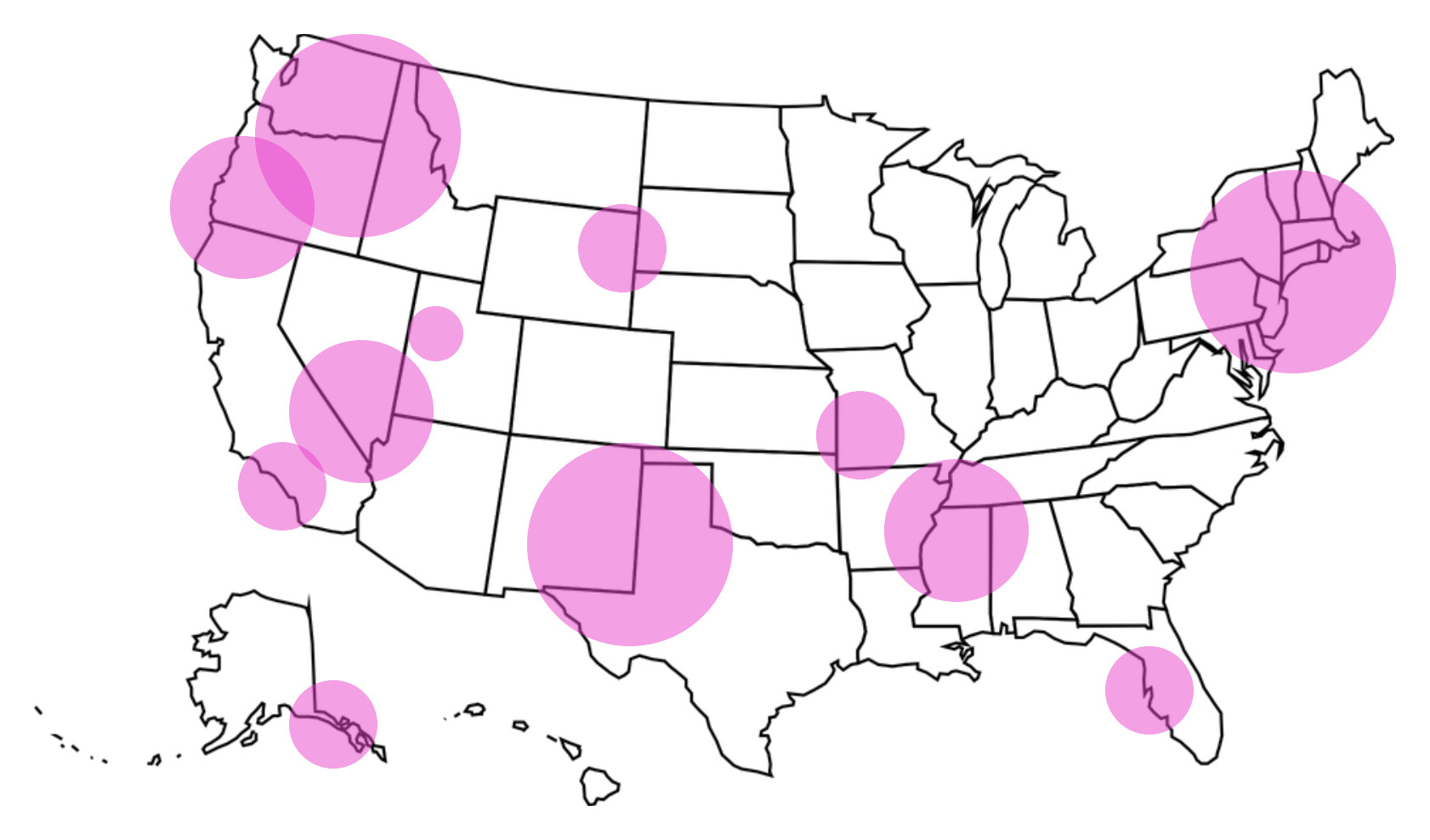
If your data includes location, you can use the same elements shown above to create a bubble map, also called a cartogram. You’ll essentially lay the standard bubble chart over a geographic map, the x-axis and y-axis becoming the latitude and longitude.

Although Excel will generate a bubble chart from your data, the process is very complex and doesn’t allow you to customize the chart according to your company standards. With Lucidchart’s intuitive interface and Microsoft Office integrations, you can quickly put together a clear, on-brand bubble chart and insert it directly into Excel.
How to create a bubble chart in Lucidchart
First, let’s turn your data into an engaging visual in Lucidchart. If you don’t have a Lucidchart account yet, sign up for your free account!
- Open our bubble chart template.
- Adjust the x-axis, y-axis, and circles according to the data you’d like to display.
- Use the properties bar at the top of the editor to adjust fonts and colors according to your brand.
If you would rather build your bubble chart from scratch, we have a few tips to help you out:
- Our opaque Venn diagram shapes work perfectly for bubble charts. To open this library, click “+ Shapes” on the left side of the editor, check “Venn Diagrams,” and select “Use selected shapes.” You’ll see your new shape library below the standard shapes.
- To add lines, click “L” or drag an arrow from the shape library. From the properties bar at the top, you can change the endpoints to “None” for a plain line.
How to import your bubble chart into Excel
Now you can insert your bubble chart into any Excel document with the Lucidchart add-on. Follow these simple steps to install and use the add-on.
- In Excel, select Insert > My Add-ins.
- Search for Lucidchart in the marketplace.
- Click “Add” to install. The add-on will appear as a sidebar.
- Once you’ve connected your Lucidchart account, select your bubble chart and click “Insert.”
Watch this short video for a complete walkthrough of the process.

Beyond bubble charts, Lucidchart can help you visualize and clarify all types of information and processes. Sign up free today.
Sign up free today.About the author

Shannon Williams graduated from BYU in English and then turned to the world of marketing. She works as a content marketing specialist at Lucid Software. Instead of writing her novel (like she should be), Shannon spends her free time running, reading, obsessing about Oscar season, and watching Gilmore Girls on loop.
About Lucidchart
Lucidchart, a cloud-based intelligent diagramming application, is a core component of Lucid Software's Visual Collaboration Suite. This intuitive, cloud-based solution empowers teams to collaborate in real-time to build flowcharts, mockups, UML diagrams, customer journey maps, and more. Lucidchart propels teams forward to build the future faster. Lucid is proud to serve top businesses around the world, including customers such as Google, GE, and NBC Universal, and 99% of the Fortune 500. Lucid partners with industry leaders, including Google, Atlassian, and Microsoft. Since its founding, Lucid has received numerous awards for its products, business, and workplace culture. For more information, visit lucidchart.com.
Related articles
How to make a mind map in Excel
Learn how easy it is to create a professional mind map in Microsoft Excel using Lucidchart in this guide. Use the shape library or SmartArt to create a mind map directly in Excel.
How to make a decision tree in Excel
Use this guide to learn how to make a decision tree in Microsoft Excel—either directly in Excel using Shapes or using a simple Lucidchart integration.
Bring your bright ideas to life.
By registering, you agree to our Terms of Service and you acknowledge that you have read and understand our Privacy Policy.