How to Create a Value Stream Map
Lucid Content
Reading time: about 7 min
Your company has recently switched to the Lean manufacturing method. You’re on board with this idea—everyone commits to less waste, making the company more efficient and your job a lot easier.
But then you realize a key part of Lean methodology involves value stream mapping. You look at one example, and you’re not even sure where you’d begin recreating this diagram for your own process. If you find yourself stuck in the situation above or you just want to find out more, use this guide to learn about the value stream map process.
What is a value stream map?
A value stream map (VSM) is a flowchart that illustrates and analyzes the steps involved in producing a product or delivering a service. Once someone maps the current state of the process from beginning to end, he or she should find areas that do not add value to the process and reduce those areas.
Value stream mapping started with Lean methodology because it is a powerful way to visualize the key objectives of Lean methodology: to control all waste, including overproduction, defective parts, and transportation of people and products.
Tips on value stream mapping
This article will focus on creating the actual VSM, but you need to spend time observing your company process before you can visualize it. Keep these tips in mind as you perform value stream analysis:
- Talk to leadership first. Make sure you understand the goals of your key stakeholders and consider those goals as you choose a process to analyze.
- Observe the process and collect data. Ask your colleagues to walk you through the existing process. Some process engineers start at the end of the process. Record the time it takes to complete each step, and record any spots of inefficiency. Data could include the number of workers, number of working hours, size of each batch, machinery uptime and downtime, etc.
- Record the current state first and then move on to a future state. Document your process as is so you can demonstrate any issues. After you have created that value stream map, you can create others to show ideal workflows.
Dive deep with our guide on value stream mapping to learn more about this methodology and when to use it.
How to draw a value stream map
Understand how to walk through your process and gather the data you need? Great. Let’s talk about how to do a value stream map and start analyzing your process.
We’ll break down the entire process, but here are the basic steps of value stream mapping:

Note: If you’re using Lucidchart to complete your diagram, make sure to use our value stream map template or add our value stream shape library. Just click “More Shapes” at the bottom of the editor and check the “Value Stream” box.
1. Determine the scope of your value stream map.
Create your start and end points first, and place them in the top left and right corners of your document. If you cover the entire supply chain, you will likely start with the supplier/raw materials and end with the customer. Use the pointed shape (found on Lucidchart in our Processes library) to represent these points.
Next to the customer, you’ll record your takt time, or the maximum amount of time you can spend while still satisfying customer demand. To calculate this number, take the available minutes for production and divide it by the required units of production.

2. Map the steps of your process.
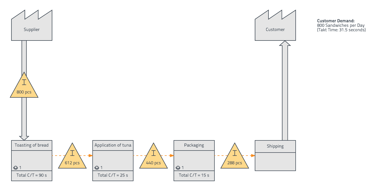
Add process boxes (using the Dedicated Process shape under “Processes” in Lucidchart) to show all the steps involved. In the corner of each process box, a small circle indicates how many operators complete this step in the process. The example below shows only one person toasting bread, one person applying tuna, and one person packaging the sandwich.
Below each process box, include a data box for your analysis (using the Other Information shape under “Information” in Lucidchart). These boxes can include, but are certainly not limited to, the following data:
- C/T or cycle time: the time to complete one part
- C/O or changeover time: the time to switch product type
- Uptime: the percentage of time that the machine is up and running
- Yield: the percentage of parts that pass inspection

3. Add inventory and wait times.
Now connect your start/end points and process boxes with arrows to show the entire process flow. In Lucidchart, the “Arrows” shape library contains all the types you need. The thick solid lines represent shipments; in this case, the supplier ships raw materials to the factory and then the factory ships the finished sandwiches out to customers. The dotted arrows, also called push arrows, represent material pushed from one process to the next.
In between each stage, use an inventory triangle (found under “Materials” in Lucidchart) to mark the number of parts you have in WIP (work in progress) at the end of each step. On the shipment arrows, you can also add truck symbols, airplane symbols, or other equipment symbols to show the method of transportation.

4. Designate the direction of information flows.
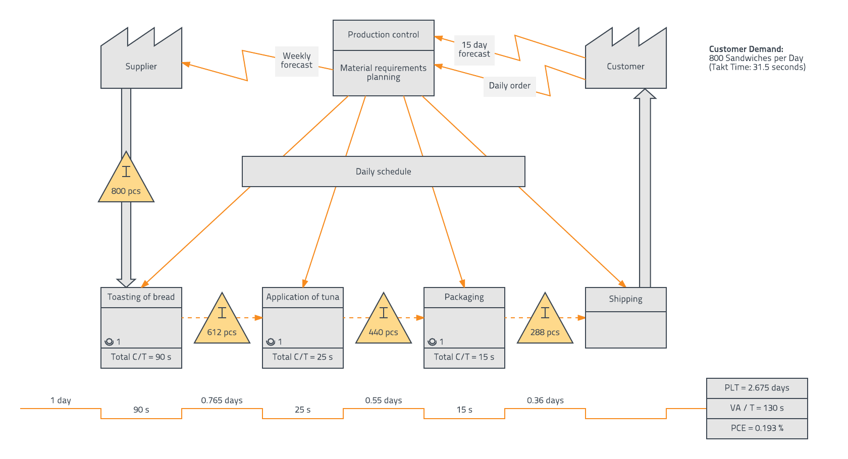
Value stream maps not only show the production process, but they also display the flow of information throughout that process. Add a production control box to represent the people scheduling and controlling production. You can find this shape under “Information” in Lucidchart, and most people place it between the start and end points. In the second half of that box, you can add this group’s responsibilities.
Then place lines of communication. Jagged lines show electronic communication, such as email, phone, or fax. You can add notes about the type of data exchanged, the frequency of this exchange, or the media used. Straight lines show manual communication, such as memos, printed reports, or in-person conversations. Add conditional formatting rules to automatically updates shapes and lines when your process is changed to accurately monitor your information flow.
In this example, production control receives orders from the customer and sends weekly forecasts to the supplier electronically, but they give daily schedules to the production staff in person.

5. Create a timeline.
Finally, you should create a timeline at the bottom of your value stream map. Because value stream maps aim to detect waste in a process, the timeline is perhaps the most essential piece.
The timeline (which you can find under the “Value Stream Map” library in Lucidchart and extend as long as you need to) has two levels. On the bottom, you’ll write down the times for value-added processes, taken from the data boxes above. On top, you’ll write down the times for non-value-added processes. Use formulas in Lucidchart to help you calculate the time accurately and monitor efficiency. In our example, we calculated the non-value-added times by the inventory we recorded to account for overproduction. Because the customer demands 800 sandwiches per day, 800 pieces count as 1 day of non-value-added time.
The timeline also includes a data box to the right that combines all this information. It commonly houses the following information:
- PLT or production lead time: the total non-value-added time from the top of the timeline
- VA / T or value-added time: the total value-added time from the bottom of the timeline
- PCE or process cycle efficiency: the percentage of value-added time out of the total process time

And there you have it!
Now that you’ve seen the value stream map process, you might be wishing for a faster way (after all, value stream mapping is about cutting down waste). Save time and get started with our value stream mapping templates.
With a completed VSM, it's time to put it into action. Cut waste and track efficiency when you share it with colleagues. Send collaborators an access link, bring up your map in presentation mode, or embed your value stream map in PowerPoint, Excel, Confluence, and other programs with our powerful integrations. Don't stop there, update your VSM as needed so it accurately reflects your current processes and makes sure everyone is on the same page.

Sign up for a free Lucidchart account to start diagramming your own value stream map.
Register todayAbout Lucidchart
Lucidchart, a cloud-based intelligent diagramming application, is a core component of Lucid Software's Visual Collaboration Suite. This intuitive, cloud-based solution empowers teams to collaborate in real-time to build flowcharts, mockups, UML diagrams, customer journey maps, and more. Lucidchart propels teams forward to build the future faster. Lucid is proud to serve top businesses around the world, including customers such as Google, GE, and NBC Universal, and 99% of the Fortune 500. Lucid partners with industry leaders, including Google, Atlassian, and Microsoft. Since its founding, Lucid has received numerous awards for its products, business, and workplace culture. For more information, visit lucidchart.com.
Related articles
How to master value stream mapping for project management professionals (PMPs)
Learn how a value stream map helps project managers work more efficiently and get steps for creating your own.
