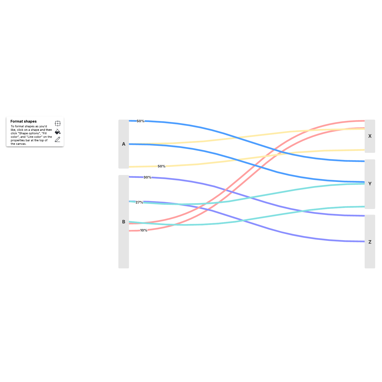
Sankey diagram
This Sankey diagram template can help you:
- Depict the flow of one set of values to another.
- Illustrate how different values relate to one another.
- Identify elements as a percentage of a whole.
Open this template and add content to customize this Sankey diagram to your use case.

What is a Sankey diagram?
The Sankey diagram template is a great way to visualize budget planning, tracking, and decision-making. But the Sankey diagram isn’t just for illustrating the flow of money. You can also visualize user flows, process optimization, energy usage, and nearly any other change over time. Sankey diagrams are commonly used by analysts, scientists, engineers, researchers, and educators.Benefits of using the Sankey diagram template
- Visualize the flow of information between two entities: Show a relationship between almost anything, like the flow of snacks in the breakroom or teams across your org.
- Provide clarity: A Sankey diagram helps pinpoint meaningful and specific changes so that you can take actionable next steps.
- Optimize your flow: From budgeting to user journeys, a Sankey diagram can help identify and address pain points.
- Identify elements as a percentage of a whole: Sankey diagrams make it easy to see patterns, trends, and anomalies within complex data sets.
- Customize and share: Easily customize your diagram to show change over a day, month, or year, then share it with other collaborators.
How to use the Sankey diagram template in Lucidchart
- Create a diagram key.
- Leave comments for other collaborators.
- Add text where necessary, and use lines and shapes for further clarification.
- Share through integrations with Slack, Zoom, and Microsoft Teams.


